

The visual strategy behind launches that land and the ones that don't.
Why your launch looked fine on paper but felt forgettable in the feed.
Every brand thinks their product launch is going to be the one that breaks through. The product is great. The team is excited. The assets are on brand. Then it goes live and... nothing. No buzz. No shares. Just a few polite likes from coworkers and a campaign that quietly disappears into the archive folder.
The truth is, most product launches don't fail because the product is bad. They fail because the reveal was forgettable. And that's a visual strategy problem, not a product problem.
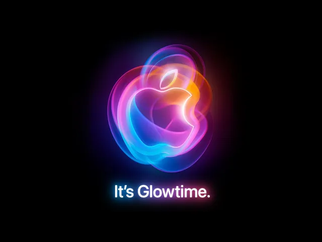
▶ Watch: Apple September Event 2024 — how Apple sequences a world-class product reveal (YouTube)
You Showed Everything Too Early
The most common launch mistake is giving the audience everything at once. Full product shots, feature breakdowns, pricing, availability, all packed into a single announcement post. It feels thorough. But it kills curiosity. When there's nothing left to discover, there's no reason to pay attention.
Apple understood this decades ago. Their launches are built on strategic concealment. Cryptic teasers. Silhouettes. Invitations that say almost nothing. By the time the product is actually revealed, the audience has already built an emotional narrative around it. The reveal becomes a payoff, not just an announcement.
Progressive disclosure works because the human brain is wired to seek closure. When you show just enough to create a question, people stick around for the answer.
Static Assets in a Motion World
Here's a stat that should change how you plan launches: 87% of marketers say video content generates more leads than static images. Brands using motion in their launch campaigns report 30% to 80% higher conversion rates. Yet most launches still lean heavily on static photography and flat carousel posts.
Motion creates perceived value. A product rotating in clean light with subtle shadows feels premium. A static product shot on a white background feels like a catalog listing. The difference isn't the product. It's the way it moves. Visual storytelling with motion can increase perceived product value by over 2,700%.
Your Launch Has No Rhythm
Great launches aren't a single moment. They're a sequence. Think of them like a film trailer: a teaser that creates intrigue, a second look that reveals more, a full reveal that delivers, and post launch content that sustains momentum. Most brands skip straight to the full reveal and wonder why nobody cared.
Pacing is everything. Apple sequences their launch content across weeks. Nike drops teasers that show textures before silhouettes before the full shoe. The audience is trained to anticipate each beat. Sound design plays a role too. Brands building modular sonic identities are creating audio signatures that reinforce recognition across every touchpoint.
The Stakeholder Problem
Here's what nobody talks about: many launches feel flat because too many people had input. Every stakeholder wants their feature highlighted. Every department wants visibility. The result is a launch that tries to say everything and communicates nothing. When everything is the hero, nothing is.
Visual hierarchy collapses. The eye has nowhere to land. The message becomes noise. The best launches are ruthlessly edited. One hero visual. One core message. One emotion. Everything else supports that single point of focus. It takes real discipline to leave things out, and that discipline is what separates launches that land from ones that just exist.
What the Failures Teach Us
Samsung's Galaxy S5 launch was criticized for looking cheap despite being a flagship device. The Galaxy Gear reveal felt cluttered and unfocused. In both cases, the products had genuine innovation inside them. But the visual presentation failed to communicate value. Ford's Edsel is the classic cautionary tale: massive hype, massive budget, zero emotional connection in the reveal.
Compare that to product launches that feel inevitable. When the visual identity is so cohesive and the reveal so well paced that the audience feels like they discovered the product rather than being sold to.
How to Make Your Next Launch Actually Land
Start with one image that could carry the entire campaign on its own. If your hero visual needs a headline to make sense, it's not strong enough. Build a reveal sequence, not a launch day. Plan at minimum three content beats: intrigue, reveal, and proof.
Use motion for everything above the fold. Static assets can support, but your primary launch content should move. Edit brutally. If a feature doesn't serve the core emotional story, cut it. Design for sound off but reward sound on. Your launch should stop the scroll visually, then deepen the experience with audio for those who engage.
The brands that make launches feel like events aren't spending more. They're sequencing better, showing less, and trusting that a well designed reveal does more selling than any feature list ever could.