

What separates visuals that stop the thumb from ones that disappear into the feed.
The design principles behind every ad you've ever paused on.
The average person scrolls through 300 feet of content per day. That means your ad, your product shot, your campaign hero image has roughly 0.4 seconds to earn attention before a thumb flick sends it into oblivion. Most visuals lose that battle. But the ones that win aren't lucky. They're engineered.
Every scroll stopping visual shares the same underlying anatomy. It's not about being louder. It's about being structurally impossible to ignore.
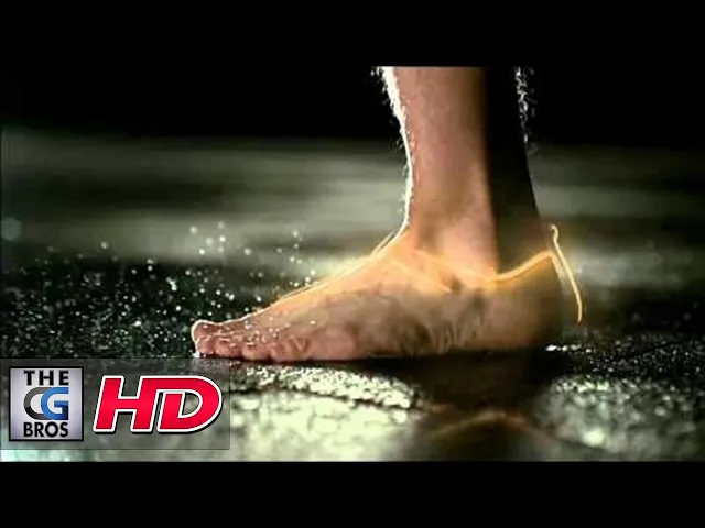
▶ Watch: Nike Bio-Morph CGI VFX Spot — a case study in scroll-stopping visual design (YouTube)
The Pattern Interrupt
Your brain is a prediction machine. It processes familiar patterns automatically and without conscious effort, which is why you can scroll through dozens of posts without registering a single one. A scroll stopping visual breaks that pattern. It introduces something the brain didn't expect, forcing conscious attention.
This doesn't mean being weird for the sake of it. The best pattern interrupts feel intentional. An unexpected color in a monochrome feed. A product floating where gravity says it shouldn't. A composition that feels slightly off balance in a way that pulls your eye in rather than pushing it away. Eye tracking research confirms it: ads with unexpected visual elements receive significantly more fixation time than predictable layouts.
One Focal Point, Not Five
The most common mistake in advertising design is trying to show everything at once. Multiple products, feature callouts, logos, taglines, disclaimers, all fighting for the same square of screen space. When everything competes for attention, nothing wins. The eye bounces between elements and eventually gives up.
Ads with clear visual hierarchy see 23% higher click through rates compared to cluttered designs. The principle is simple: one hero element that dominates the composition. Everything else is either supporting that element or it shouldn't be there. Apple has built an empire on this. One product. Clean background. Massive negative space. The visual confidence to show one thing and trust that it's enough.
Contrast Is the Real Currency
Color theory matters, but contrast matters more. The visual that stops the scroll isn't necessarily the most colorful one. It's the one with the sharpest distinction between elements. High contrast color combinations can outperform subtle designs by up to 40% in conversion rates. That's not a design preference. That's behavioral data.
Contrast works on multiple levels. Light against dark. Warm against cool. Sharp detail against soft blur. Geometric precision against organic texture. The strongest visuals layer multiple types of contrast simultaneously, creating depth that the brain can't process passively. It demands active attention. Red buttons outperform green ones by 21% in conversion tests, not because red is inherently better but because red creates more visual tension against most backgrounds.
Motion Changes Everything
Motion based creative is up to three times more effective at capturing attention than static images, which quickly become background noise after repeated exposure. Animated ads drive 20% to 30% higher click through and conversion rates, and brand recall jumps 71% with optimized motion compared to static alternatives.
But motion isn't just about making things move. Bad animation is worse than a good static image. The motion needs purpose. A product rotating to reveal a material finish. A shadow shifting to communicate depth. A subtle camera drift that makes a still scene feel alive. The best motion design feels like breathing, not like a seizure.
Micro animations on websites improve conversion rates by up to 23%. On social platforms where users expect movement, static content increasingly reads as unfinished or low effort.
Negative Space Is Not Empty Space
Brands terrified of wasting real estate cram every pixel with information. But negative space, the area around and between design elements, is one of the most powerful tools in visual communication. It directs focus, implies premium quality, and gives the brain room to process what it's seeing.
Every luxury brand understands this instinctively. Apple's product pages are mostly white space. Nike's campaign visuals let the shoe breathe. The negative space isn't the absence of design. It is the design. It signals confidence. It says this product is important enough to stand alone, and the brand is confident enough to let it.
The First Frame Rule
For motion content, the first two to three seconds determine everything. If the opening frame doesn't hook, the rest of the animation might as well not exist. The strongest 3D product animations lead with the most visually dramatic moment. A product assembling itself. An explosion of color. A material transition that feels tactile even on screen.
The same principle applies to static visuals in carousel formats. The first image carries the entire weight of the swipe decision. It needs to function as both a standalone visual and a promise that what comes next is worth the effort.
Designing for Sound Off, Rewarding Sound On
Most social content is consumed with sound off. Your visual has to work in silence. That means the composition, motion, and hierarchy need to communicate the full message without audio support. But the visuals that truly stop scrolling reward the people who turn the sound on. A satisfying material sound when a product clicks together. A tonal shift that reinforces a reveal. Audio doesn't replace visual strength. It amplifies it for the people who are already paying attention.
What This Means for Your Next Campaign
Start with one image. If it can't stop a scroll on its own, no amount of copy or targeting will save it. Build your composition around a single focal point with aggressive contrast. Use negative space deliberately, not as leftover area but as a structural element. Add motion with purpose, not just movement for the sake of movement. Test your hero visual in the actual feed environment, not in a presentation deck where everything looks good.
The brands consistently producing scroll stopping content aren't spending more on production. They're spending more time on the anatomy of the visual itself. Because in a feed where attention is measured in fractions of a second, structure beats spectacle every time.